CSS float, clear 속성 살펴보기
CSS에서 float 속성은 요소를 문서의 좌우측으로 떠오르게 하여 텍스트나 인라인 요소들이 그 주위를 감싸도록 만드는 속성입니다. 이 글에서는 float와 clear 속성에 대해 설명합니다.

1. float 속성
float 속성은 박스 모델(Box Model)의 일부인 요소들을 좌우로 떠오르게 하여 배치합니다. 이는 텍스트와 인라인 요소들이 떠오른 요소 주위를 감쌀 수 있게 합니다.
1
2
3
.element {
  float: left; /* 또는 right */
}
1.1. float 속성의 값
none: 요소를 떠오르게 하지 않습니다. (default 값)left: 요소를 왼쪽으로 떠오르게 합니다.right: 요소를 오른쪽으로 떠오르게 합니다.inherit: 부모 요소의float값을 상속받습니다.
2. float 속성 값 및 예시
float 속성은 인라인 요소가 아닌 요소(주로 div 등)에 적용됩니다. float이 설정된 요소는 문서의 흐름에서 벗어나지만, 그 주위의 요소들은 문서의 흐름을 유지하면서 떠오른 요소의 주위를 감쌉니다.
1
2
3
4
<div class="container">
  <div class="float-left">Left Floated</div>
  <div class="content">This text will wrap around the floated element.</div>
</div>
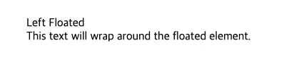 float: left 적용 전
1
2
3
4
.float-left {
  float: left;
  width: 200px;
}
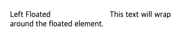 float: left 적용 후
위의 코드는 float-left 클래스를 가진 요소를 왼쪽으로 떠오르게 하고, 그 다음 요소가 그 주위를 감싸도록 합니다.
3. clear 속성 값 및 예시
float 속성으로 떠오른 요소 다음에 위치하는 요소는 종종 빈자리를 채우기 위해 올라오는 경우가 발생합니다. (원하는 대로 배치되지 않을 수 있음)
이 경우
clear속성을 사용하여 떠오르는 속성을 제거할 수 있습니다. 이렇게clear를 사용하여 브라우저 오류를 해결하는 것을clearfix라고 합니다.
none: 떠오른 요소의 주위에 자유롭게 배치됩니다. (default 값)left: 요소의 왼쪽에 떠오른 요소가 없도록 합니다.right: 요소의 오른쪽에 떠오른 요소가 없도록 합니다.both: 요소의 양쪽에 떠오른 요소가 없도록 합니다.inherit: 부모 요소의clear값을 상속받습니다.
1
2
3
4
5
<div class="container">
  <div class="float-left">Left Floated</div>
  <div class="content">This text will wrap around the floated element.</div>
  <div class="clear-both">Cleared Content</div>
</div>
1
2
3
4
5
6
7
.float-left {
  float: left;
  width: 200px;
}
.clear-both {
  clear: both;
}
위의 코드는 clear-both 클래스를 가진 요소가 왼쪽과 오른쪽에서 떠오른 요소들로부터 벗어나도록 합니다.
4. 레이아웃에서 float 속성 사용 시 주의할 점
4.1. clearfix
위에서 살펴본 것과 같이 float 속성을 사용한 후 그 다음 요소가 원하는대로 배치가 안되는 경우, 이를 해결하기 위해 clearfix를 사용합니다.
가장 보편적으로 많이 사용하는 방식으로 ::after를 사용하는 방식이 있습니다.
1
2
3
4
5
.clearfix::after {
  content: "";
  display: table;
  clear: both;
}
1
2
3
4
5

<div class="clearfix">
  <div class="float-left">Left Floated</div>
  <div class="float-right">Right Floated</div>
</div>
아래 영상은 clearfix 내용과 관련된 Steve Griffith님의 Youtube 영상이 있어서 공유합니다.
4.2. 정해진 너비와 높이 설정
떠오른(floated) 요소는 width와 height가 설정되지 않으면 예상치 못한 레이아웃 문제를 일으킬 수 있습니다. 명시적으로 설정해주는 것이 좋습니다.
1
2
3
4
5
.float-left {
  float: left;
  width: 200px;
  height: 100px;
}
5. float 속성 대신 flexbox와 grid 사용하기
현대적인 CSS 레이아웃 방식인 flexbox와 grid는 더 많은 유연성과 여러가지 기능을 제공합니다. float 속성은 주로 텍스트 감싸기 용도로 사용되고, 레이아웃을 구성할 때는 flexbox 와 grid를 사용하는 것이 좋습니다.
아래 코드들은 flexbox와 grid의 간단한 예시입니다.
5.1. flexbox 예제
1
2
3
4
5
<div class="flex-container">
  <div class="flex-item">Item 1</div>
  <div class="flex-item">Item 2</div>
  <div class="flex-item">Item 3</div>
</div>
1
2
3
4
5
6
7
8
9
.flex-container {
  display: flex;
  flex-direction: row;
  justify-content: space-between;
}

.flex-item {
  flex: 1;
}
5.2. grid 예제
1
2
3
4
5
6

<div class="grid-container">
  <div class="grid-item">Item 1</div>
  <div class="grid-item">Item 2</div>
  <div class="grid-item">Item 3</div>
</div>
1
2
3
4
5
6
7
8
9
10
.grid-container {
  display: grid;
  grid-template-columns: repeat(3, 1fr);
  gap: 10px;
}

.grid-item {
  background-color: #ccc;
  padding: 20px;
}
6. 결론
float 속성은 간단한 텍스트 감싸기와 특정 레이아웃 작업에 유용하지만, 전체적인 레이아웃을 구성할 때는 flexbox나 grid와 같은 현대적인 레이아웃 방법을 사용하는 것이 좋습니다.
float 속성을 사용할 때는 clear 속성을 적절히 활용하고, clearfix를 통해 예상치 못한 레이아웃 문제를 해결하는 것이 중요합니다.